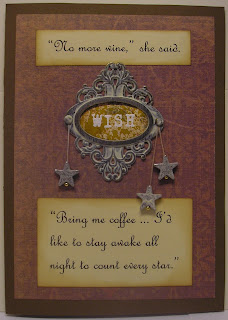
Welcome to this week's Studio L3 Compendium challenge.
I finally followed the directions and did exactly what Tim described on page 48 for the Altered Metal with Paint technique. I even used a "sanctioned" Holtz piece -- and some, ahm, cheaper than you could believe star charms that were most definitely not Holtz.
Still, let's all be honest: Once you've learned some of our Mr. Holtz's better than life techniques ... even the cheapest crap looks fantastic!
That's what he gets for sharing.
Again though I did stick to the instructions using mostly the recommended products, and I could not be happier with the result.
One thing I am sort of cheating on this week is the combination of challenges. I know, I know everyone does it.
So, for hardly the first time in my life I'm saying ... if it's good enough for them ... it's good enough for me ... which brings us to this: Welcome to my Gingersnaps' color challenge piece!
I always want to particpate in the Gingersnaps challenges, but can't find the time. I'm not going to mess around anymore. If I can combine a challenge or two, and I haven't been admonished not to do so by a particular challenging blog, I'm going to mix and match and bring 'em together.
How else does everyone do it all? They don't, that's how.
One more note before I go: The background for the embossed "Wish" sentiment in the ornate plate is beautiful, in my opinion, with spots and blotches and dots of color from Adirondack color wash.
Color wash is excellent stuff and my first ever foray into the Holtz/Adirondack/distress art that was not prompted by a challenge or instruction.
I'm sure that what you're now thinking to yourself is "What?" "She creates like an expert!" "How is this possible?" "She's been showing off and blogging for ... how long has it been ..."
Which is the very final mention I have: Look out for upcoming events during this week that might include a blogaversary at the very place you are right now!
Because when I'm not busy in the workshop, the office or the kitchen ... I'm a news junkie ...
Monday, January 31, 2011
Saturday, January 29, 2011
Happy Birthday!: A Drunken Stampers Challenge
♫ Happy Birthday to you ♫
♫ Happy Birthday Dear Drunken Stampers!♫
♫ Happy Birthday to you! ♫
That's right! This week we celebrate the first birthday of Drunken Stampers!
It hardly seems possible that it's been one little year ago the Drunken Stampers pub opened and invited all of us in for a chat and a challenge.
They've helped us meet stampers across the world, and gave me my first-ever Design Team home.
They gave us a sketch challenge and an inchie challenge, two techniques and creative avenues that were new to me at the time, and 50 other fun, interesting and daring challenges.
This week's challenge asks only that you help us celebrate the birthday of Drunken Stampers by joining the party!
My challenge piece for the week includes a nod to the prior years' sketch and inchie challenges as well as the April 2010 challenge for Earth Day which asked us to use a magazine or newspaper clipping.
All of that is rounded out with another new-to-me technique: The sentiment on this notebook is dymo embossed card stock which has been edge inked and colored.
I learned this idea only last week from Drunken Stampers' co-owner Spike -- just a little proof that you can see something amazing and wonderful and inspiring every week at Drunken Stampers!
Friday, January 28, 2011
Weathered wood grunge: A Studio L3 Compendium Challenge
Woohoo! It's Studio L3 Compendium Challenge time!
I was so excited to try this technique, on page 50 of the Tim Holtz Compendium of Curiosities book, that when it was announced this week I immediately pulled out all of the necessary tools.
Immediately, as in only a few minutes after Linda could have possibly posted the challenge.
And then work interrupted as work sometimes does on Monday mornings since I'm supposed to be working on Monday mornings. Can you imagine my boss expecting me to work when there's a new Compendium challenge at hand?
Unfortunately she's the absolute best boss I've ever had, and a wonderful woman, so she could call me two days after I'd died and I'd clock in. Yeah. I'm a sucker.
Which means it wasn't until last night that my craft room door finally closed to any needs not related to ink and paper.
After that, well, another of Tim's brilliantly cool and simple techniques lead the charge. Less than an hour after closing the door I opened it to show My Guy this finished pedestal-style card.
When was the last time you finished a new card in that amount of time? I don't know when I did, but I bet it was around age five, after I got to use something besides crayons but before I was allowed to handle markers.
Come to think of it, even though I'm really very happy with this card, I should be quiet and perhaps humble about the time I took to make this card.
What if you say "Holy sh*t ... she could have fixed that hideous thing if only she'd taken a bit more time ..."
Monday, January 24, 2011
Frosted Petunias Artful Bag challenge: January
If you're anything like me, and you're here so you must be a bit like me, you enjoy seeing other art, craft and hobby blogs.
After all, it's fun to see what others are creating, and it's extra fun to join challenges. Right?
Because of this I'm sure you've ended up at Wishin' I Knew How to Blog (or you're there now since I've just given up the link).
... thanks for returning!
OK, now you also know that beautiful Electra creates some of the most wonderful pieces! So, when I read about the awesome Artful Bag submission she'd posted I had to stumble on over to Frosted Petunias to check out the Artful Bag Challenge for myself.
Which means I'm now here, boring you so fully that you left 10 minutes ago to get aglass jug of wine, when this entire explanation could have been stated as: Here's my January submission for the Artful Bag Challenge. It's a Cricut Tags, Bags, Boxes and More shape cut from a K&Company paper with Holtz, Cricut, Fiskar and random embellishments!
Thanks for dropping in, tune in to your inner bag lady on and share your creation at the Artful Bag challenge, and don't forget to join in the fun of Pay it Forward (if you'll have time in 2011).
After all, it's fun to see what others are creating, and it's extra fun to join challenges. Right?
Because of this I'm sure you've ended up at Wishin' I Knew How to Blog (or you're there now since I've just given up the link).
... thanks for returning!
OK, now you also know that beautiful Electra creates some of the most wonderful pieces! So, when I read about the awesome Artful Bag submission she'd posted I had to stumble on over to Frosted Petunias to check out the Artful Bag Challenge for myself.
Which means I'm now here, boring you so fully that you left 10 minutes ago to get a
Thanks for dropping in, tune in to your inner bag lady on and share your creation at the Artful Bag challenge, and don't forget to join in the fun of Pay it Forward (if you'll have time in 2011).
Pay it forward folks!
But first, as usual, a story: On a Thanksgiving Day many years ago my family were all at my sister's house and, having a few hours before friends would arrive or the turkey would be done, we collectively decided to watch the movie Pay it Forward.
Well, not collectively exactly. My dad, who had already seen the movie, warned us "that's not a movie to watch today."
He told us the movie is sad. Really, very sad, he said. To which my mother and brother and sister and I replied, "Puhshaw."
I can't remember exactly what happened after that, between all of the teary eyes and stuffy noses, but I will forever remember one important lesson: While at times a father's advice might not be quite right, it's best to heed his warning when he tells you that a particular movie is really, very sad.
Of course, everything turned out well even on that very day since it gave my dad another subject on which he could tease all of us, and Pay it Forward is going to turn out good again today. Because today we look at another Pay it Forward story.
This story is all about crafty bloggers doing a little Pay it Forward art! I've no idea where it started originally, but my own part in this story began last night while visiting Zoe's blog, This little place.
She had posted her own Pay it Forward notice: Now I'm on her list and will receive a little Zoe creation sometime in 2011!
I know you want to play along, too, so here's how: To begin, be one of the first five people who leave a comment on this post asking for a piece of art from me (I'll request your mailing address via e-mail, and will send a surprise to you sometime before the end of 2011).
Then, Pay it Forward with your own post and art offering!
I can't wait to see who signs up and the great pieces that travel here and there and everywhere!
Saturday, January 22, 2011
Sunshine: A Drunken Stampers Challenge
About 12 years ago I found a sun mobile at the Nevada Museum of Art gift shop. I've never seen another one and have no information as to the maker.
Until recently it's hung in various parts of my homes, and is now tucked away only because paper mobiles do eventually become too damaged by sun and dust and moisture to display.
So, I'd been thinking of making one for myself. And then the Drunken Stampers team came up with the theme for this week: Sunshine!
And then, lo and behold, my friend who lives in dreary Cincinnati and who works in an even drearier office said that she wished she had a sun mobile to hang at her cubicle.
Folks, that's what we call Serendipity! A sunshine mobile for a friend in need of a little vitamin D.
As in Drunken Stampers! I know, I know ... can you believe I managed that sunshine to vitamin to Drunken Stampers connection?
Drop in at the DS lounge to show us where your artistic vitamin D leads before midnight January 28!
Wednesday, January 19, 2011
Colorful layered fragments: A Studio L3 Compendium Challenge
This week at Studio L3's Compendium Challenge it's all about the stamps, Fillable Pens and fragments.
Which means that I expected to love this one. Turns out that I don't like it all.
This technique can be easily recreated in exactly the way our Mr. Holtz describes it. The completed bits can be used to make outstanding pieces of art just like the one Linda put together to post with the challenge.
I like the example in the Compendium, and all of the challenge pieces posted at Studio L3.
And I like this calendar page I've made. It's only not the kind of thing that makes me say "Wow! Just imagine what can be done with that!"
Before someone looks more closely at my lovely February page and realizes that I cheated I'd like to say something else: As usual I cheated, but only on this finished piece.
After making two fragments I disliked, the third one I made and didn't like was torn apart to make the fragment you see here.
Part of that dislike could be my stamps: I used flowers with very bold lines. But they were the stamps I chose after trying others, with thinner lines, and didn't like them, either.
Maybe it's the alcohol ink colors that I'm unhappy with: It's not as if I own Tim's full line. I do have a dozen colors though, which are all favorites in my repertoire.
The element I know is not the problem are the Adirondack Fillable Pens. Those things make me happy. Smile like a toddler with a new toy kind of happy. Given a choice between meeting Tim Holtz and owning a bucket of these pens would be a hard decision kind of happy (don't be silly, of course I'd choose to personally thank and hug Mr. Holtz, but play along with my verbal illustration, OK?).
Anyhow, aside from obviously not using the recommended background, my big time cheat of the week is that the fragment isn't stamped with a cool winged heart. Instead it's got my own wee Sharpie drawing (another favorite tool of mine, but that started back when I was a kid stealing them from my Dad).
I'm so relieved that Mr. Holtz tells us, Linda reminds us and all of us chide one another: Make each technique your own.
Because I can't stick to the instructions no matter how clearly they are laid out in front of me.
Monday, January 17, 2011
Peachy Keen Stamps Challenge 43
Hi folks! It's been a great weekend at our house! We had friends over for a Mexican Night party that included homemade guacamole and tacos in handmade corn tortillas (awfully dry; we need more practice) and, of course, margaritas.
Our wonderful friends brought yummy spicy refried beans, delicious Spanish rice, a fantastic Spanish-style salad, always popular corn chips with Pico de Gallo and a few brews (not everyone cares for Margarator tequila lime juice).
Then Mimosas served with My Guy's hash brown, bacon and egg breakfast made The Day After positively enjoyable (for everybody but My Guy, come to think of it)!
So, it's been a great bit of fun to join in a Peachy Keen Stamps challenge sketch, therein shifting back to playing in the craft room after having spent a weekend in the kitchen and dining room.
Creating this piece I used Die Cuts With a View glitter stack card stocks along with a Fiskars punch for the flowers and sentiment plaque. The sentiment is a Making Memories magnetic stamp embossed with one of my very favorite powders: Pastel pink. For the flower stems I used vinyl coated wire that makes the flowers stand up by themselves!
Thanks to Peachy Keen for the needed creative reset ... you also should take a minute to see what the Peachy team has put together!
After that ... see you tomorrow for the Studio L3 Compendium challenge!
Saturday, January 15, 2011
Fuzzy: A Drunken Stampers Challenge
My first thought for the Drunken Stampers Fuzzy Challenge was to create something with ferrets, or at least using a photo of one of our ferrets, since we often refer to them as "The Fuzzies."
But I decided that our little monsters aren't yet ready for stardom and that I should stick to flocking powder.
Unfortunately the flocking powder didn't work out. Actually, it worked out: I didn't like the result. The problem, I think, is that I only have white flock. There's no written evidence, but it's a good guess that the white was purchased with the idea to use it for Christmas. Snow or something.
But even in person the white flock is hardly visible. Plus I'm too impatient or dumb to figure out how to make it work really well. Yeah. I'm not going to be running out for more flocking powder.
Anyhow it's all OK because plenty of paper companies make flocked, printed designs. The one on this box cover is from Die Cuts With a View La Creme stack. It's a stack full of gorgeous, vintage wallpaper style prints that I use often.
After finishing my little box I realized that I could have skipped the flocked paper, too, because the green flower center is fuzzy corduroy! Yay!
Now, you should start working on your own fuzzy project and give us a share at the Drunken Stampers Challenge blog before midnight January 21st.
Oh yeah! I nearly forgot! That's a Tim Holtz idea-ology hitch fastener standing tall as the box lid handle! Cool, huh? Love those hitches!
Alright the real Fuzzies won a chance at notoriety: Sparky is the brown one. That's her not wasting time digging Santa's presents out of the stocking, instead she's just stealing the whole thing. Then you've got Finn. He's protecting the booty from dangerous toy-stealing monsters.
Tuesday, January 11, 2011
Distress misting masks: A Studio L3 Compendium Challenge
Generally we crafters can be talked into absolutely anything that adds glimmer, shimmer and shine, so this week's Studio L3 Compendium Challenge using Tim Holtz's distress misting masks technique is sort of like trying to entice bears with honey -- easy enough to be considered cheating.
After all, at least half of all of us who've been roped into scrap booking, card making or altered art have found ourselves addicted because we know it'll mean playing with lots of stuff covered in glittery goodness.
This technique from the Compendium of Curiosities plays perfectly into that need: It adds shimmer and color and, depending on how much spritzing you do, a little or a lot of texture.
My own spritzes, over a worn lipstick-inked sheet and flourish mask, have a lot of somewhat chunky texture -- think freckles on the arm of a red head.
The single warning I'd like to offer to anyone who hasn't tried this one yet: Hide your wallet if you're on a budget (My Guy is protecting my empty money sock).
Of all the Holtz Compendium techniques this is the one that has most made me want to run straight out and buy a bucket full of masks and the other three main technique products (which I can't list because it'd give away the instructions that we've been admonished not to share).
So, try this one if you dare and then be sure to show off your piece at Studio L3 before 8 p.m. January 16.
Saturday, January 8, 2011
Rusted Grunge: A Studio L3 Compendium Challenge
This piece was completed about 24 hours after Linda posted the Compendium Challenge for this week.
So, what took me so long to get it posted? Well, let's read a little story, shall we?
A couple of years ago I had found a couch, love seat and reading chair set at a local thrift store for a very decent price. I recognized that the set wasn't perfect -- it had some wear, but no actual damage and was ugly as hell.
Still, I've never been especially bothered by ugly furniture. In fact, if it's cheap, useful and our ferrets can't get inside of it, ugly is a kind of character enhancement, you know?
Anyhow, I lured My Guy to the thrift store to approve the purchase of ugly furniture he'd be stuck with (it's easy to lure either of us to a thrift store ... used stuff for cheap ... what's not to love?).
He agreed that it was ugly, but OK, if it'd serve the need we had and we could afford it ... go ahead.
Now, from the moment I'd seen this furniture I'd been planning to overcome a bit of the uglies with the addition of throw pillows and one or two lap blankets that were in storage from Before We Became Us. I thought the newer and older stuff might go together pretty well.
Plus, these pillows and couch accoutrement were not cheap, previously-used bits. These were rather expensive items I'd collected through many years to dress up my first set of thrift store living room seating. These items I thought beautiful: Made well of fine fabrics in deep, attractive colors.
I learned two things the day the ugly couch set and attractive storage stuff arrived together in my living room.
First, I was absolutely correct about my own stuff and the "new" thrift store furniture: It matches perfectly.
This led to the second thing I learned that day: I don't have bad taste, only a taste for ugly stuff. Ugly isn't an enhancement for me. Ugly is a requirement.
It's hardly believable, but all of this also explains my creation for the Compendium Challenge of the week: I know it's ugly, and I like it anyway.
Still, I'd held off on posting it because I thought maybe I'd keep this ugly thing for me, and then make something better for this post.
Turns out I'm perfectly comfortable sharing my love of ugly stuff. Yeah. You're welcome.
Now, let's see what kind of taste you have ... show off your creativity today with Studio L3's Compendium Challenge!
Whiteout!: A Drunken Stampers challenge
Wow! Can you believe the white cards this week at Drunken Stampers?
Of course my first thought at an all-white creation was to create something related to weddings: But holy cow ... there's just a whole lot of cool and beautiful and touching with this week's challenge to use all white.
Not a wedding as far as the eye can see, which is great for those of us who hate to "dress up" and refuse entirely to squabble over a handful of expensive flowers.
Anyhow, I suppose I should apologize for the not-quite-all-white card you see here. I swear each of my bits, including the sentiment frame and the buttons, looked white ... until I got them all together. At which point I discovered that there's white and then there's white.
I'm clearly in the white family, though, so it's not too much cheatery.
Anyway I got to create that completely awesome background! Don't you love it? It's based on a cool technique that was explained to me by Netty at Netty's Craftings.
The harlequin-style design is from a Sizzix Stampin' Up Texture Plate. But instead of running it through an embossing machine I covered the plate with perfect medium, "stamped" the paper, and then heat embossed with sparkle embossing powder.
My version of this technique is very simple: Go here to check out Netty's lacy background (hers is so beautiful I thought she'd managed to stamp with actual lace).
So, do you know the difference between white and white? Create an example and show it off to us at Drunken Stampers! We can't wait to see where your whiteout leads!
Wednesday, January 5, 2011
I was an e-Team blog hop winner last year!
Way, way back in 2010 I won an e-Team blog hop ... OK, it was something like three weeks ago, but what's the fun of saying three weeks ago?
The hops are hosted by eclectic Paperie and are always packed with inspiration and information. The hop from which I was chosen as a winner earned for me a fantastic Twinery prize and the extra bonus fun you see here.
Holy cow, huh? And, as I wrote to Daisy at eclectic Paperie: I love bags of any kind. Any bags. Honestly I'm a container girl in general. I own a couple of pairs of shoes and essentially three pairs of pants ... and roughly three dozen backpacks, messengers bags and purses, boxes and chests in every room and more dressers than a single human needs.
So, you can see why I nearly passed out at the sight of these gorgeous paper and vellum bags. Plus the plastic-lined, fold-down bags! You're familiar with them ... they're similar to the ones in which coffee beans are packed.
Honestly, I had absolutely no idea I could buy those bags! Guess what my Christmastime candied pretzels will be stuffed into next year?
Whew ... as you can see I haven't even fully "unpacked" the gifts ... I'm just too excited. I want to savor first simply knowing that I own these wonderful things ... then it'll be what to make, what to make ...
While I'm doing that: You make sure to follow the E-Team hops and check out the deals and fun at eclectic Paperie!
Saturday, January 1, 2011
New Year New challenge: A Drunken Stampers challenge
Happy New Year everyone! Surely you've got big plans for the next 52 weeks, and we hope those plans include a weekly visit to the four of us at Drunken Stampers!
We're starting off Two Thousand Eleven with a healthy jump into something New! That's right, just use something you've never used before to create an amazing bit of art, then post it with us at DS' Mr. Linky!
My own new is a little UTEE and PearlEx pendant with a Holtz swivel clasp and blingy rhinestone! For me, the melting pot and UTEE are completely new!
This charm is a little basic, I realize, but give me a break -- it's my first ever attempt!
So, guess what I'm doing to celebrate New Year's Day? That's right! I've got the fire extinguisher nearby and a full bottle of UTEE! I'm either partying with some cool new projects, or a house fire. I suppose it all depends on how much New Year's Day Guinness I have while practing UTEEing.
I'll keep you updated! And you update us at the Drunken Stampers lounge, pub and craft house!
Subscribe to:
Posts (Atom)