Wednesday, June 30, 2010

Alcohol ink monoprint train wreck: A Studio L3 Compendium challenge

OK, honestly the Compendium challenge at Studio L3 this week is about the technique on page 51, alcohol ink monoprint.

MY creation however is a monoprint train wreck.

The thing is, I'm stuck for time this week which means I'm also stuck with this god-awful pile of paper and glue and glitter and ink for my Week 3 challenge submission.

HEY! What's that, over there? Behind you?

Yeah, yeah, let's go look over there ... nothing to see here, nothing at all.

Seven weeks: Gifts from the gardening gods

Any of you who have traveled to northern Nevada are probably aware that this region is a bit arid.

A cold glass of iced tea does not need to sit on a coaster. There is no condensation. We measure humidity in negative numbers.

Yet, watering our garden for 20 minutes only three days a week is thus far resulting in happy corn, onions, potatoes and herbs.

The corn is now nearly two feet tall and we're already discussing how we'll know for sure when it's time to dig up the potatoes.

So, we might be jinxing ourselves, but who cares? Let's plan a barbecue now! Corn on the cob! Roasted potatoes and onions! Cucumber salad with homegrown dill! Vases of lavender on the table!

Is anyone else getting hungry?

Sunday, June 27, 2010

Twilight fever: A Drunken Stampers Challenge

What I know about the Twilight book series is very limited. I believe it's about non- traditional, glittery vampires and, I surmise from the endless movie trailers, werewolves.

Still, I'm reasonably knowledgeable about paper and glue and glitter, so I couldn't pass up this week's Drunken Stampers Twilight Challenge. One doesn't have to be educated about something, like this book series, to pretend, right? How would any of us get anything at all done if we always waited for useful knowledge?

This means that my card with the phrase "Real men Sparkle," could be anything. I dunno. I'm aware that I heard the phrase in reference to Twilight, but have no idea if it was a quote from the book or only catchphrase to sell t-shirts. It might have been a comedienne mocking a line in the movie?

Either way, the phrase is clearly endearing to me because after hearing it only once months ago it is still rolling randomly around in my brain.

I used papers from Die Cuts With a View, and cuts from Cricut's Winter Woodland and Tinker Bell cartridges. The heat embossing on the background is blue tinsel powder on a Stampin' Up wheel image. "Sparkle" is a glossed glitter paper also from DCWV.

And one last thing: Real men DO sparkle. I'm sure about this because all of the real men I know are covered in glitter that has been spread throughout the house by his wife or girlfriend or partner or child.

Shine on boys!

Thursday, June 24, 2010

Fragments basics: A Studio L3 Compendium challenge

Hello again! It's week two of the Compendium of Curiosities Challenge, hosted by Linda at Studio L3.

This week the challenge is from page 62 of Tim Holtz's book: Fragments basics. Essentially, this means creating our very own versions of his image-backed fragments.

I'm starting this by telling you that between Linda, Mr. Holtz and Sue at Reno, Nevada's Scrapbook Paradise, my tiny crafting budget is quickly running dry (dearest Sue helped me to find my first pack of fragments, and a whole new project I'll post about later this week).

The worst part is that this technique is ANOTHER one that will probably get used a lot in my craft room. Folks, I just don't need anything else to draw me off into the Crafty Twilight Zone -- my attention span is already in the negative range.

Oh well. At least I got to make this cool card! K&Company paper forms the "curtain" over the beaded tassels and the main background. The 1920's flapper girl highlighted on my very first fragment also is from this paper pack!

The yellow background features pressed embossing from a Hello Kitty folder and heat embossing from Stampendous powder in silver.

The sentiment frame is a soft chipboard piece colored with Close to my Heart sunflower and Distress Ink wild honey. The rim has been dotted with Stickles pearls.

Ah, the sentiment. I love this part: vis chaque jour avec enthousiasme: JOIE.

A literal translation is, I think, Screw each day with enthusiasm! JOY! I'm sure that someone who actually reads French would say the translation is  fill each day with enthusiasm.

But, if you're like me, you probably prefer "Screw each day with enthusiasm! JOY!"

Honestly. How often do you get to say that? Prost!

Wednesday, June 23, 2010

Cherries! Yay!

Cherries from the grocery store!

Half of the bag of cherries are squishy, the other half too firm. Half too sweet, the remainder too bitter.

And yet, the joy! The joy of a fresh cherry!

Just think what we'll be finding at street corner stands and Farmer's Markets for the next few months.

Bring on the Real Foods of summer!

Coloured images and don't forget the bling: A Drunken Stampers Challenge

You're going to think I'm crazy after discovering that my submission for this week's Drunken Stampers Challenge is colored with crayon. Crayola's, even.

It's likely that most people in this week's challenge, Peg & Spike's Faves, will use sexy and pricey markers, perhaps a lovely watercolor pencil, or I should think at least some really interesting ink.

I chose crayons. What can I say? Some days I just really want to play with crayons. Especially my favorites from Binney & Smith because they have that special aroma. Admit it. You know. It smells like Kindergarten and brand new coloring books and everything fun about childhood.

Plus, there's the added joy of those awesome adult toys (... for crying out loud ... not THOSE toys ... this is a family blog, people). I'm talking about paper cutting machines and stamps and embossing guns and embossing powder!

I cut a "tattoo" heart from the Cricut Indie Art cartridge and gave it a shadow backer that was squished in a cherry blossom embossing folder (extra shinies back there are thanks to white pigment ink and clear embossing powder).

The main heart was outlined in purple Sharpie (again with the Sharpies) and filled with Crayola's blue violet.

The technique, and yes I love referring to ANY use of Crayons as a Technique, is to press hard while coloring. Chunks and bits of the crayon should be left behind on the paper.

Once the entire blank space is filled, blast the project with a heat gun until all of the chunks are melted into dark spots and streaked, whitish edges have appeared near the outlines.

Add a few rhinestones and, if you just can't put away the embossing gun, create a "hidden" sentiment with sparkle embossing powder.

Tuesday, June 22, 2010

Catching up and thanks

Hello all! I'm completely behind my time in posting about nearly everything.

There are paper projects to complete and post, gardening updates to tell you about, a recipe to share and a few other things I've wanted to get in here.

This week is going to be much fuller than I have time, so you'll see some posts from me, but probably half of what I want to share.

Until then, I wanted to make sure you got a tiny view of a beautiful weekend.

We were camping near Markleeville, California, with tents, fold-up chairs and beer coolers. Great friends, warm fire at night and during the day, well, Just Look At The View.

Friday, June 18, 2010

Water stamping: A Studio L3 Compendium challenge

Readers here who've perused my blog know that we have a sort of problem which makes us unable to properly follow instructions. Especially with recipes for food, but now apparently with recipes for ink to paper techniques as well.

You'd think then that I'd know better than to participate in Linda's Studio L3 Compendium challenge.

For instance, when our Mr. Holtz clearly states in his Compendium of Curiosities "...apply in a circular motion," follow his instructions. Or, at least don't be upset when your own "dragging motion" inking looks more like a blurry super graphic from 1976.

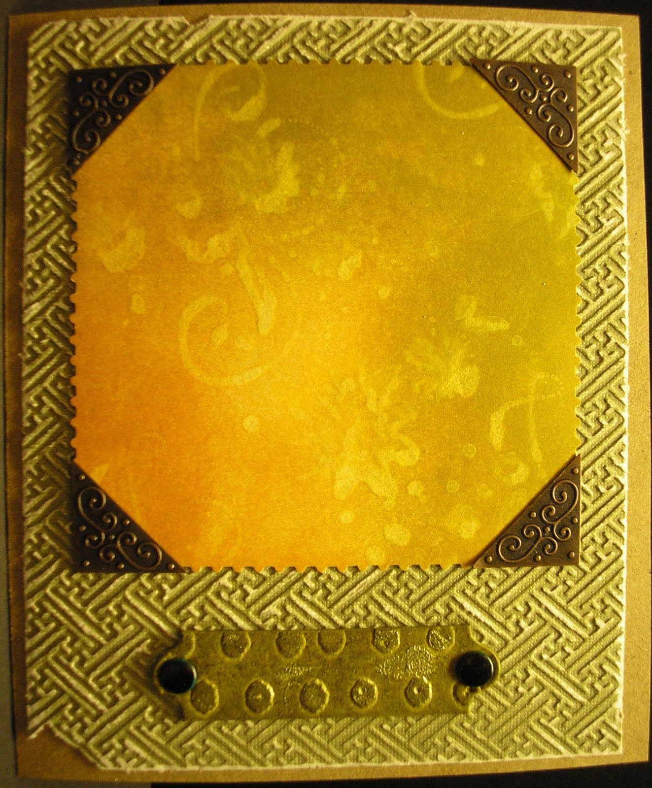
Next, when the instructions point out that the technique works best with "...bold, deep colors," do not choose, as your very first ever Distress Ink, two tones of brown. BROWN.

Still, friend Tim does repeatedly tell us to believe in the artist within ... even if that artist seems less like Picasso and more like Sally from Mrs. Smith's second grade class.

So, the creation you see alongside this post is done with Crushed Olive and Wild Honey on a four-inch square. The water stamping is courtesy a Stampin' Up wheel named ... something I don't remember.

You'll see more of this technique from me in the future. It's very, very cool.

What's not really very cool at all are my photography skills which resulted in this overexposed photo: At least the watery image shows up nicely.

The pressed embossing is from a Cuddlebug Asian folder, appropriately sanded, and the nameplate, sans text, is Grungeboard.

The plate is coated with more of the Crushed Olive ink, then lightly dipped into a smear of Dimensional Pearls Lettuce.

I have to mention that I love this particular creation as it reminds me of my grandmother: For many years she had a HUGE crushed velvet couch in those fabulous 1970s colors of harvest gold and avocado green with "reverse embossed" flowers.

My god. It was awful. And I loved it. Perhaps it is her fault that I am drawn to absolutely hideous furniture.

Tuesday, June 15, 2010

Steppin' up with the step cards

Hopefully this'll be a quickie post as there's a lot to do still tonight, tomorrow and the remainder of the week: Meaning if this doesn't get done now ... well, you know how it goes.

So, this step card has been awaiting some embellishment for weeks. The base and background, a flocked series of blocks cut from a Die Cuts With a View stack, turned out so beautifully that it was with distress that I considered what to add.

Finally, about two hours ago I realized: Single color, simple embellishments would be perfect.

The gold, heat-embossed sentiment and bicycle are from a Stampin' Up set called Chemin faisant (available here from Snowmanlover).

The metal medallion is from a set My Guy purchased for me more than five years ago and the burnt orange and yellow swirl designer paper behind the sentiment and elements is from a pack I found many, many more years ago.

Finally, if you're wondering how I managed to get that DCWV flocked paper cut so perfectly so that the damask-style design is maintained: Thank you Design Studio. I swear, one of these days I'll post a .cut file.

Until then, make sure you drop by Snowmanlover's Stampin' Up site, linked three graphs ago, and her blog linked here: You definitely need a few of the Stampin' Up sets, especially the French sets and the wheel stamps.

Father's Day card: A Drunken Stampers Challenge

The problem I ran into that took me so long to finish this project, is that these step cards are already so cool. I make the step base, then add a background ... and bang ... awesome (wait until you see my next step card, that one might never have embellishment because I like the main base so much).

Anyhow those devils at Drunken Stampers challenged me and you, too, to create something awesome for dad! Which means I finally had to make some decisions.

Here's what we ended up with: A step card that is going to look awfully pink and gay (as in delightful) to a lot of you. But my dad is an architect and artist who has never felt discomfort with any colors because they are "girly."

He's still got a solid man card as he prefers scotch, his favorite color is blue and he's likely hangin' out at home waiting for Germany to trounce everyone in the World Cup.

Back to the card: As noted we have a step design with DCWV background, three sentiments created on the Cricut (ENJOY is a bunch of separate letters nudged together with DesignStudio), the circles are punched from various scrap pieces with a 1/2 inch punch and the final additions are two metal embellishments in the shape of a champagne glass and a martini.

The main sentiment and "DAD" are cut from DCWV Rockstar stacks and ENJOY is cut from glitter paper (LOVE glitter paper).

The best thing of all is that when I call Sunday to tell my dad "Happy Father's Day" it'll be for the second time this month: I originally thought Father's Day was on June 6. So, he received a very jovial and confusing "Happy Day" call two weeks ago.

He probably thought I was drunk. Unfortunately it wasn't alcohol making me stupid, only my DNA.

Happy Father's Day!

Friday, June 11, 2010

Birthday Card: A Drunken Stampers Challenge

The founders of Drunken Stampers are celebrating birthdays this month! Woohoo! Go here to check out Peggy's world and here to see what Spike is up to.

In honor of what must have been two of the most important days in world history, they're celebrating with a Birthday Card challenge.

My own card took all week to figure out. Who knows why. Sometimes the creative whatchamacallits just won't cooperate.

Finally everything kicked in this afternoon and I realized the perfect card would be for another June baby, using the focus of one of her favorite friends (pet chickens) and a big trip coming up (East coast to Canada to West coast to home).

The card base is cut from recycled card stock with Stampin' Up wheels rolled across the top and bottom in, I think, Very Vanilla. The embossing is Martha Stewart copper.

Our chicken friend is provided by Cricut's From My Kitchen collection: So cute, don't you think? The chicken "parts" are from Die Cuts With a View Travel stack (which I found at Marshall's C.H.E.A.P.).

The tag is trimmed from a larger piece made on the Cricut and is embellished with a corduroy brad.

Oh, and the tag sentiment also is embossed with MS copper using a Close To My Heart embossing pen (I'm fairly sure you can use any Zig pen for embossing as it's all pigment ink, but having a tool dedicated to a particular use never makes me cry).

Thursday, June 10, 2010

Mad Hatter Day: A Gingersnap Creations blog hop

Run across the street to Gingersnap Creations to check out all of the awesome Alice in Wonderland creations put together by the Gingersnap Creations team.

Alice and the Cheshire and the Hatter and their friends are already intriguing -- then when you see what the Gingersnap artists have come up with -- WOW! You'll be amazed!

My own card celebrates the Unbirthday tea party scene which is a combination of events in the original story, but is now a single part of our collective memories courtesy of Disney.

I do wish you could be here, looking at my card in person. Not that it's so great or improved by seeing it in person: But if you were here I could say "And LOOK! The March Hare is flocked! FEEL!"

The Merry Unbirthday theme, by the way, had to go on the card as I have been thinking all week long about the Drunken Stampers' birthday card challenge. Alas, no good ideas yet for that one.

Now, go to Gingersnap for the blog hop ...

Sunday, June 6, 2010

Four weeks later: Less salsa, more potato salad

It's been a month since our house took a shot at becoming Our Salsa Farm.

Despite hurricane winds, Springtime snow and two separate freezes, we're actually still in the game!

We haven't managed to purchase or plant new tomato plants yet, but the Yukon gold potatoes are so determined to grow some of them have pushed the drip lines out of the way to reach for the sun.

Our onions, oh my! They are growing with such commitment that we can actually measure a difference in stalk height from yesterday to today (no kidding!).

And while the second post-planting snowstorm killed the first corn sprouts of the season ... several more have popped up and are inches high (inches!)!

The herb garden is happy as well: Mint is attempting to choke out everything else, tarragon is shading the entire garden, green onions and chives are happily going to seed already and the dill is fluffy and aromatic.

As for the ornamentals: For once we're doing better with produce. The last freeze seems to have ruined the Japanese maple for the year and caused the just-budding iris to fold over and die. Damn.

We haven't yet determined whether or not the hostas are going to do well this year.

Cross your fingers that we survive bugs, birds and sunburns and the next gardening-related post you see here will have pictures of produce!

Grill pockets

Next time you fire up the grill, plan to cook your vegetables or even a simple dessert in aluminum foil pockets.

To make the pockets, tear off a strip of foil about one foot deep (we prefer the 18-inch rolls, but the shorter stuff will work, just don't overfill).

Fold the strip in half so that you're left with a squarish shape. Next fold over about 1/2 an inch of an open side edge, crease this fold with your finger. Repeat so that the edge has been folded twice. Now repeat this process on the opposite side.

Fill your pocket roughly halfway with potatoes, carrots and onions (or whichever edibles you prefer). We stir olive oil, cracked pepper and ground sea salt into the vegetables before filling the pockets, however you can do whatever you prefer.

Use less oil for crispier style foods, and more for a creamier finish.

Carefully press air out of filled pockets, and fold the top in half and in half again, creasing as you fold to ensure the pocket is sealed.

Unfortunately you'll have to figure out heat and cooking time, as it will differ depending on which foods you put into the bags: Our vegetables were on the grill for about  40 minutes.

The idea here is to have several pockets filled with vegetables that are cooking while you're spending time "watching" chicken or other main dishes placed directly on the grate. When you're ready to pull the main dish, the vegetables are ready, too.

Tonight we even made a couple of dessert pockets:

2 large apples, cored and sliced
1 1/2 tsp granulated sugar
1/2 tsp cinnamon
2 Tbsp butter, melted

Combine the sugar and cinnamon. Pour the melted butter over the sliced apples, then add the sugar mixture. Stir to coat the apple slices. Separate into two foil pockets. Place dessert pockets on the grill for roughly 10 minutes. Serve apples to two people or split over ice cream for four.

Friday, June 4, 2010

Bird on a string: Inspired by Gingersnap Creations

I often take time on Fridays to hop around, blog to blog, checking in on what people have been doing for the previous week.

Today found me here and there and, as usual, at Linda's Studio L3. Linda does amazing work of which I'm often jealous. Today was no different and I ended up scurrying from her blog to Gingersnap Creations, where the artists are asked to use Wings (this is a very abbreviated version of their theme -- drop by Gingersnap for more information).

Anyhow, I've got 10 million ideas for who the hell knows what, one of which is a sort of steam-punky bird mobile. Which means Linda's beautiful work, along with that of the rest of the Gingersnappers, really got me thinking again about the metal bird I'd like to make.

But, I had intentions of doing A Lot today. I didn't have time to mess with flashing and rivets and on and on. There was no time for a freakin' paper bird either. This means I got absolutely nothing done EXCEPT the bird.

She didn't turn out the way I'd imagined, with movable wings, but for a very first ever try at this thing that's been bouncing around my brain for a few years ... not too bad.

Our little bird is made with Cosmo Cricket paper in Cricut-cut shapes held together with embroidery floss stitching.

Oh, and scarlet rhinestone eyes.

Whew. Now I can finally move on and play some Sims3 Ambitions ... unless the need to start working on the tin bird forces me out of my chair ...

Hello Kitty Greetings card swap

Defining my confused creativity and style results in deciding whether my creations are simply eclectic or proof of a deep and possibly dangerous neurosis.

Recently my paper craft posts have focused on darker color tones and images, which I love. Today I'm back with a swing into eye-meltingly bright colors and theme, which I also love!

That's right, it's the teaser for a Hello Kitty Greetings card swap I joined over on the Cricut forums. I'll post a full photo of my finished project after the swap deadline passes.

Until then I hope your days and nights are as happy and bright as a glitter-covered Hello Kitty card! Or, as intense and reflective as an ink-dipped embellishment.