I'm continually surprised by what we create because it so often begins as one thing and ends up being something entirely different.
Today's project, using a fancy gothic window from AlphaStamps, careened away from my original intention of a modern styling and ended up in this primitive style with a somewhat voyeuristic theme.
I can't remember what caused this change except to point you to nearly all of my previous posts ... in which my typical inability to Stick With A Subject is apparent.
Anyhow, I love the Dresden border and the crackled pink finish and the adorable couple who are just about to kiss.
In the full picture our lovers are on the way to sharing a cocktail provided by cupid. That makes so much more sense than cupid with a backpack full of arrows, don't you agree?
Now I need to get back to creating since I have eleven more fancy gothic windows sitting on my craft desk!
Because when I'm not busy in the workshop, the office or the kitchen ... I'm a news junkie ...
Wednesday, December 26, 2012
Saturday, December 22, 2012
A moon who is happy, but not giddy
This piece is for a friend whose father passed away several years ago during a full moon.
Understandably, she has an ever-deepening attachment to full moons and related imagery.
The moon you see today is a vintage image from the Graphics Fairy. He's a favorite of mine and one I've used previously because he seems content and happy, but not giddy.
I'm not a fan of giddy-looking celestial beings ... those and very, unbelievably happy clowns Freak Me Out.
Because happiness of that level only comes from insanity or pharmaceuticals or sex. Not that I have a problem with blissful sex, it's the intersecting thoughts of s-e-x and clowns ... that ... ewww.
Hopefully I'm not offending anyone out there with a perfectly normal clown fetish.
And now I suppose it's time to wrap up this post since I've again worked myself far away from the original topic.
Aren't you impressed that I can so thoroughly lose track of a subject?
Enjoy your day my friends ... if you can stop thinking about crazy-happy clowns and whatever it is that made them that way.
Wednesday, December 19, 2012
Hark. 'Tis a 10-second blog post
One black card base.
Pearl white background.
Gold tinsel embossed work "hark."
Two Octopode Stars and Lily Chilvers' Octopode "Whimsical Christmas Angel".
Stars, eyes and halo popped with Glossy Accents.
TADA!
Simple. Clean. Adorable.
A holiday card fit for a unique and wonderful friend!
Pearl white background.
Gold tinsel embossed work "hark."
Two Octopode Stars and Lily Chilvers' Octopode "Whimsical Christmas Angel".
Stars, eyes and halo popped with Glossy Accents.
TADA!
Simple. Clean. Adorable.
A holiday card fit for a unique and wonderful friend!
Wednesday, November 14, 2012
Sabbatical complete: Projects from the journey No. 4
Delving further into art styles and mediums that I enjoy working with has led me to create Artist Trading Cards using balsa and pine.
Sometimes I keep these simple, with only a coat of distress stain over a mask and a few letters or a wood die cut for statement.
But when I'm feeling like going crazy with hours of layering and inking and embellishing we begin with one of these wonderful Masonite window panes from AlphaStamps, and end up with a window through time.
I'm also fond of vintage images, usually incorporating something from the Graphics Fairy or from Twisted Papers' risque collection.
Another common element are aluminum or multiple-paper-layer letters cut from the Alterations Carnivale strip die. As you've read here before I've discovered in myself a fascination with creepy circus imagery and the Carnivale font fits in perfectly (even when I'm not trying to go all crazy clown cabinet).
Depending on who I'm planning to give the piece to I might also add a hand-cut and -folded stand, a bit of magnet or just nicely finish the back: After all, a wooden ATC with a frame is thick enough to stand on its own.
The only negative thing I've found about these little pieces of portable art is that they are so fun and easy and quick to make that I often put one together, wrap it up and ship it off before taking a photo or only remembering at the last moment to click a pic. Which means many of these photos are even more wonky and out-of-focus than my usual half-assed photographs!
Post a comment or drop a line if you're interested in a more specific explanation of any of these projects, and add a link if you've got your own version of a wood ATC to show off!
Thursday, November 8, 2012
Shelter for eight-leggers closed for holiday
Spider webs strung throughout the pot of aloe. |
Since we live in The Country you're more likely around our house to run into something with a multitude of legs than you are a human being.
As often as we remember to do so we give a warning to our house guests who might have a spider phobia. After all, we have cobwebs in every corner of every room. Along the door frames and strung from leaf and stem and vase.
Usually I don't remove those, either. Perhaps it's awful for our family and friends. Perhaps everyone we know thinks I'm a terrible housekeeper. Perhaps a trip to our house strikes terror into the hearts of our visitors.
One would think I'd be ashamed of this since I am not, in fact, a terrible housekeeper. As it is I'm an inconsistent house keeper since I'm also an artist and have a job, but generally the house is reasonably well kept.
Still the webs, spiders and related dustiness remain because I don't see the point in killing them. They don't hurt anything. They're often very interesting to look at and on a sunny morning the cobwebs are quite beautiful.
Nothing though is designed to remain forever and on Thanksgiving we always host an open house. For this event I do a deep clean: Scrub the walls, wipe the window sills, shine the windows and remove the cob webs.
So, goodbye spiders, for a few weeks.
I'm sure your lovely homes strung hither and yon will be in place again before the next solstice.
Tuesday, November 6, 2012
Sabbatical complete: Projects from the journey No. 3
Through the past few months I've become intrigued and inspired by the art of Nichola Battilana at Pixie Hill.
Her works should be pictured in the dictionary, as they say, alongside the words whimsical, eclectic and breathtaking.
Try as I might, the visual fullness and decadence she provides in her art eludes me, but I've managed to at least complete a handful of pieces that incorporate some of the techniques and objects she uses.
There's the cabinet I posted last week HERE. And now, today's reveal: My Moon Rise Mountain solar box.
These creations are obviously much different from Battilana's works, which is fantastic because I'm not attempting to copy her art.
However, I'll be happier when I more closely mimic her full, too-much-to-ever-see-it-all design and when my finished pieces suggest an organic and natural origin, as if Rhea and the Oreades personally lent a hand in the creation.
Ah, well. I'll get there eventually. In the meantime I'll continue this joyful sharing with you and hope that if you haven't bounced over already ... you'll now visit Nichola at Pixie Hill because her work is truly amazing.
Monday, October 29, 2012
Sabbatical complete: Projects from the journey No. 2
I hope all of you have been enjoying the season of the witch, werewolf and horrible sexy kitten costumes for children (yup, actually saw a sexy kitten costume for a child -- I really hope karma is on the way to that company).
Anyhow, it's such a pleasure to see all of the art you've been showing: Skeletons, crows and graveyards abound everywhere!
My own reach into the beautiful, strange darkness that is Halloween made use of a Haunted Door Shrine Kit from Alpha Stamps.
So, you can pretty much stop reading here and check out the photos, or keep reading to learn how I put together the various shrine elements! Thank you for coming this far, and if you're one of the steadfast souls in the path of Sandy, may you find safety and calm to ride out the storm!
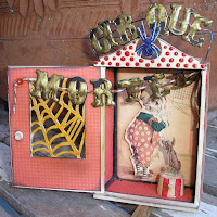
This project, roughly the size of a chunky ATC, is covered in acrylic paints that I crackled, aged and inked for a vintage finish.
The shrine interior is lined with designer paper, inked and edged with black paint for aging effect. Our circus clown, and performing dog, are Antikamnia images.
Text, Cirque Mortel (which hopefully means, more or less, Deadly Circus), was cut multiple times from black stock on Tim Holtz's Carnivale Sizzix strip. Each letter cut was stacked and combined until each letter is roughly 1/8 inch thick.
These were carefully dipped in gold Ultra Thick Embossing Enamel. The "Cirque" text was attached to blue-dyed copper wire on the top and the "Mortel" text was attached with a twine that tucks inside of the shrine when closed.
Hey! You're still here! Thank you again! Have a great Halloween week!
p.s. sorry about the wonky ass layout here ... I don't know what the hell Blogger is doing ... maybe it's a Halloween TRICK or treat!
Tuesday, October 23, 2012
Sabbatical complete: Projects from the journey No. 1
Today's project show-and-tell is something I completed back in late August, right before I went on sabbatical.
It's another reveal that deserves big time thanks, this time to Sandy Ang at Sandy's Space. A beautiful woman who creates unbelievable art, often with designer papers, she chose me as a winner of some pieces from Fundamentals and Ruby Rock It's decoupage line.
The card you see here is a pedestal style using a sweet teddy bear Fundamentals decoupage that is perfect for a brother-in-law who is expecting the arrival of a baby girl.
You can't imagine how easily the pieces punched out of the sheet that has an entire second teddy bear set, nor how cleanly they came out -- only a few "chads" to trim. Then I got another happy surprise when the layering went together quickly and neatly.
All I had to do was choose background paper (Die Cuts With a View), ink a handful of edges and TaDa!
Isn't this wonderfully cute and glittery? Isn't this the card you'd expect to see on a pink-wrapped package for a baby girl?
You're maybe thinking to yourself "Um, yeah, great for a baby girl ... a little weird for me and my adults friends."
Ruby Rock It's has you covered with some gorgeous Victorian-style images such as birds and flowers. I'll show off some of these in the future, but for now take a look HERE at Sandy Ang's blog. There you'll see some of the amazing RRI decoupage pieces she has put together.
Thanks again Sandy, for your kindness and sharing!
It's another reveal that deserves big time thanks, this time to Sandy Ang at Sandy's Space. A beautiful woman who creates unbelievable art, often with designer papers, she chose me as a winner of some pieces from Fundamentals and Ruby Rock It's decoupage line.
The card you see here is a pedestal style using a sweet teddy bear Fundamentals decoupage that is perfect for a brother-in-law who is expecting the arrival of a baby girl.
You can't imagine how easily the pieces punched out of the sheet that has an entire second teddy bear set, nor how cleanly they came out -- only a few "chads" to trim. Then I got another happy surprise when the layering went together quickly and neatly.
Look at the layers! |
Isn't this wonderfully cute and glittery? Isn't this the card you'd expect to see on a pink-wrapped package for a baby girl?
You're maybe thinking to yourself "Um, yeah, great for a baby girl ... a little weird for me and my adults friends."
Ruby Rock It's has you covered with some gorgeous Victorian-style images such as birds and flowers. I'll show off some of these in the future, but for now take a look HERE at Sandy Ang's blog. There you'll see some of the amazing RRI decoupage pieces she has put together.
Thanks again Sandy, for your kindness and sharing!
Thursday, September 13, 2012
Bugaboo mini set Cute Skulls makes funky gift set
More than a year ago I picked up the Cute Skulls mini set from Bugaboo Stamps and turned the digistamps into a birthday gift for a friend: A fun, funky set of stem charms in a storage tin.
I started with an Altoids sours tin (can you get them anymore? I don't know) and a can of soft pink spray paint. The paint is a wonderful Krylon product that covered the Altoids manufacturer printing in only two coats and dried completely in only a few hours.
Next I cut a skull stamp using a Cricut machine and the Cricut stamp material. I then stamped the skull with black archival ink onto the top of the sprayed tin. One wee bow and a few sticky gems later and the stem charm tin is finished!
Next I cut a piece of heavy black card stock to fit inside of the tin and covered that with pink sticky-back felt. I cut six slits into the felt and added a hitch fastener to the center for easy charm storage and removal.
The charms, each featuring a different Bugaboo Cute Skull, were printed on white shrink film and shrunk before being coated with Krylon clear.
I attached each shrunken skull to a bit of chain with a lobster claw clasp at the end to wrap around and attach to a glass stem.
And there you have the gift! That's so easy for quite a neat little surprise, isn't it?
So, if you want to take all of this to the next level as I did, print a sheet of the Cut Skulls "designer paper" and use a paper cutting machine to cut a tiny gift bag.
I also used the same die cut design from the Cricut stamp cut mentioned earlier to cut a heavy black stock skull which I employed to make a gift card that mimicked the tin with another bow and more fake gems.
Ain't it neat? I think so, too!
Although I was annoyed to discover that my friend doesn't like pink, she only has some of it because it's been foisted on her ... her personal favorite is red.
Oh well. I guess I'll just have to find another round Altoids tin!
Wednesday, September 12, 2012
Johnston, Housewives of Idiotville and Other Bullshit: How to stop the media coverage
A thoughtful note to those who are not aware: It is possible to see information relating to who has visited your blog. It's possible to see which posts were read, which photos have been viewed and where "they" who visited live.
And, shock of shocks, news outlets also track these things. And with much better accuracy. Much. Better.
So, please people, please for the love of Jebus and all that is magical ... please stop clicking on stories that you know are sure to be stupid.
Or at least stock clicking on the random stupidity and then following this with a full read and comment.
Especially if your entire comment will be something to the effect of "this story is stupid" or "why don't you cover the real news".
News outlets also track how much time you spend reading this shit.
Do you really think news sites can't gather the statistics of which idiotic stories you're reading, how long you're staying and the number of comments you share on these moronic stories?
Sisters. Brothers. Friends and neighbors: The so-called "liberal media" and the so-called "conservative media" ... they know what you're reading and commenting on. They know it and they sell it to advertisers.
They don't care that your comment was "... this shit be dumb." They only care that the time it took you to read the story and write that comment could be sold to advertisers.
If you want to read actual news, the things that mean something to you and to yours and to anyone besides the dimwits who populate every damn random web site between here and kingdom come ... read, really read, the few important stories in existence that haven't been preempted by items covering the bride wars of X factor.
And then comment on those few important stories. Share an opinion. Even if you're not sure what you're talking about. Piss people off if you must. Because that will cause conversation in the real world and, domino effect, more real people read the story and more real people comment and *BANG* real news gets coverage.
Especially if it's a local news outlet: Read and comment every god damn hour if it's local news, people, because local news is all important news begins.
Trust me.
Trust yourself.
Clearly there's a certain amount of coverage of stupid shit that is only because of the company which owns the local news outlet.
But you and I know that the biggest reason your local online newspaper and television coverage includes B.S. about this reality show and that contest of overeating hot dogs in who-the-hell-knows where is because you read it and commented on it the last time they wrote about it.
They're selling your reading minutes ... make them count.
Please.
Because I for one am so fed the hell up with seeing news headlines that scream about the latest reality television show that we both know has nothing at all to do with reality.
And, shock of shocks, news outlets also track these things. And with much better accuracy. Much. Better.
So, please people, please for the love of Jebus and all that is magical ... please stop clicking on stories that you know are sure to be stupid.
Or at least stock clicking on the random stupidity and then following this with a full read and comment.
Go read real news ... or OFF with your head! |
News outlets also track how much time you spend reading this shit.
Do you really think news sites can't gather the statistics of which idiotic stories you're reading, how long you're staying and the number of comments you share on these moronic stories?
Sisters. Brothers. Friends and neighbors: The so-called "liberal media" and the so-called "conservative media" ... they know what you're reading and commenting on. They know it and they sell it to advertisers.
They don't care that your comment was "... this shit be dumb." They only care that the time it took you to read the story and write that comment could be sold to advertisers.
If you want to read actual news, the things that mean something to you and to yours and to anyone besides the dimwits who populate every damn random web site between here and kingdom come ... read, really read, the few important stories in existence that haven't been preempted by items covering the bride wars of X factor.
And then comment on those few important stories. Share an opinion. Even if you're not sure what you're talking about. Piss people off if you must. Because that will cause conversation in the real world and, domino effect, more real people read the story and more real people comment and *BANG* real news gets coverage.
Especially if it's a local news outlet: Read and comment every god damn hour if it's local news, people, because local news is all important news begins.
Trust me.
Trust yourself.
Clearly there's a certain amount of coverage of stupid shit that is only because of the company which owns the local news outlet.
But you and I know that the biggest reason your local online newspaper and television coverage includes B.S. about this reality show and that contest of overeating hot dogs in who-the-hell-knows where is because you read it and commented on it the last time they wrote about it.
They're selling your reading minutes ... make them count.
Please.
Because I for one am so fed the hell up with seeing news headlines that scream about the latest reality television show that we both know has nothing at all to do with reality.
Monday, September 10, 2012
CC2C No 20: Enameled stamping
Challenge: The StudioL3 Compendium of Curiosities
volume II Challenge, technique 20
Technique: Enameled Stamping, page 44
Main products used for this project: Card stock, recycled plastic, memory pin, tattered florals die, distress ink and clear embossing powder.
Project observations: Linda absolutely nails the feeling with this technique when she points out that it’s a basic one you’ll use again and again.
It’s easy to create, and can result in a classically-styled
project or modern or steam punk or whimsical depending on the stamp and colors
you choose to use.
Aside from the technique of the week, I used the recycling packaging technique to create a stained-glass like "good life" tag (thanks to Terry at Terry's Work in Progress for the "good life" stamp!).
Thanks for dropping by and I hope you join this week’s challenge!
Friday, September 7, 2012
An unhappily eventful week: Day 8 with a sad update
Last Friday morning found me with a bit of soreness in my jaw and a mild earache.
Since I've been known to suffer from nearly year-round allergies and strep throat on occasion I figured "Meh, sinus troubles of some kind." By Sunday it was pretty clear that the trouble was either The World's Worst Sinus Infection or a tooth issue.
I would have called to ask someone what they thought, but we had no damn phone service at our house.
Mom, can't you see that I'm sleeping? |
Yeah.
So, with the tooth pain at a level that called for medical attention or a dangerous mix of over-the-counter remedies we decided to drive the couple of miles from our house to make a phone call.
I called one of my best friends who also happens to be a tooth expert, or as some people might say a "Dental Assistant."
Vishnu love that woman: She talked me down from going to Urgent Care and begging for marijuana or heroin or whatever it is they prescribe these days for pain.
Instead I settled in at home with a fistful of ibuprofen, lots of mushy food and waited for Holiday Monday to turn into Dental Office Open Tuesday
During these activities we had another problem arise. The worst problem of all. The Worst.
Probably we could have caught things earlier, making them Not Quite As Bad, if we hadn't been so wrapped up in being pissed off that we had no phone and no helpful input from the service provider. Or if I hadn't been whining about my fucking tooth.
If not for those things, maybe we wouldn't have The Worst: A dear sweet ferret who we've had since she was only five weeks old is very probably very, very sick. Not going to be with us much longer very sick.
Our house is no longer a phone service dead zone, Tuesday afternoon I received a bottle of pharmaceutical pain killers and I'm now throwing a pail of wishes to the stars that an appointment for tooth fixing on Thursday turns out to be the worst thing next week.
Because if that's the worst thing ... it means our dear little fuzzbutt is OK and once again the undisputed Ruler Of The House.
UPDATE: Between the time I wrote this post and 3 a.m. this morning our little fuzzy named Sparky went to join her brother Finn who passed away last year. It's sad for us, but they're probably happy to be together again ... he loved cuddling her and she loved dancing on his head.
What the hell is happening here?
An addendum …
Until today, August 25, 2012, Not a Moment to Spare has been almost exclusively an art blog.
Because when I started this adventure in February 2010 I thought that what I wanted was a single bit of the universe in which all I dealt with was happiness and creativity.
Unfortunately I was not then and am not now motivated exclusively by happiness or creativity.
Often I am motivated by politics or What I Think Is Right or pop culture or food or What Pisses Me Off or Who The Hell Knows What.
And I need to share those feelings and thoughts and reactions here, or be someone who I am not.
I'm adding this addendum to my blog as a sort of warning: I'll continue posting projects and art, and other things as I always have.
But, because I want this blog to be a part of my life, not a version of my life, I'll be including more profanity and smartass comments in general, along with links and separate columns that are related only to my opinions of Who The Hell Knows What.
And, look at that, I’m introducing my first opinion: No one, especially an artist, should compartmentalize his or her life or opinions only to create a comfortable environment for his or her audience.
I hope that those of you who I have come to love so much will continue visiting and commenting and even begin to lay out the occasional opinion, because without sharing and discussion and thoughtful arguments ... how do any of us grow?
Sunday, August 26, 2012
Forehead tattoos instead of dirty pictures
The United States
Appeals Court has told cigarette companies that they do not have to put nasty
pictures on packaging (story provided on msnbc).
Isn’t this decision
a relief? Not because I have children who I wish to protect from such horrific
images as those proposed by the people who suggested and probably wrote the law.
A friendly calf who probably knows that cigarette smoking causes cancer |
Not because I’m a
former smoker who still occasionally considers grabbing Just One to enjoy with a pint (don’t worry, I tried this theory about six months ago … I was green with …
ugh).
And not because it’s
bullshit to allow a product to remain legal all the while implying that it’s as
bad as methamphetamine.
Back at the Ranch
of Intelligence and Obviousness, we know that this legislation not moving
forward is a relief because: If a person smokes he or she is already
knowledgeable about the dangers. Honestly, haven’t we officially reached the
point in the United States that if you smoke; you know it could eventually kill
you?
Some people might
argue they didn’t understand the news stories, warning labels or doctor’s
suggestions or didn’t trust the dastardly Liberal Media or assumed the
warning labels were only another government lie since cigarettes could still be purchased at every mini mart, grocery store and truck stop from Boise to Punta Gorda. But
these groups aren’t going to be dissuaded from smoking by a horror movie photo
on a cigarette pack.
"There is no further education to be gained by the second kick of a mule.” -- Random somewhat related quote of unknown authorship found by My Guy
Our government either
needs to make the sale of cigarettes a crime (after all, calling a particular
activity a crime has worked so well with all those other pesky things like
marijuana) or they need to Provide The Truth and then Let It Be. No more allowing
cigarette sales while using dirty pictures in an attempt to correct the corrupted
science that our government and cigarette companies trotted out 50 years ago
that said cigarette smoking was safe, and Oh My God, You Are So Cool.
Allowing the rotten
teeth and throat hole photo law to move forward would only further prove that
wealthy cigarette makers have many politicians in their pockets (we can still
buy these cancer-causing fire sticks), and that many of these same politicians
will do anything to join a Look I’m Doing The Right Thing group (you can only
buy cigarettes with icky photos).
If it’s necessary
to pass a law related to cigarette smoking, since we’ve grown bored with issues
like our slow economic growth, poorly-managed government agencies and, gasp, Afghanistan,
perhaps our leaders could pass a simple one-size-fits-all law: All cigarette
manufacturers must place true messages of doom on their packaging (which they
already do) and smokers who find themselves adversely affected in any way that
is related to smoking or addicted to smoking cannot sue for damages, but can
receive a free Warning Label forehead tattoo! Woohoo! Free tattoos people!
In fact, this very
same law can be applied to all of the crap sold alongside cigarettes: Soda pop
and cigars, candy bars and potato chips, ground “pink slime” beef and chemically-enhanced,
low-calorie “diet snacks.”
Because really, I know
we’ve all consumed at least one of each of those products in the past few
months: Even though we’ve received honest information about these products and know
that chips and soda and slime are crap.
So we’re either able
to take responsibility for consuming shit that we know is shit or we step up
and take our free forehead tattoo.
p.s. I’m aware that
cigarette logo and scary photo laws have been passed and enacted in some
countries … so tell me, has the desired result, less smoking, become a
reality? Did you support this before it became law? Do you support it now? I’m interested
in your opinion!
Tuesday, August 7, 2012
CC2C No 16: Perfect pearls mist
Challenge: The StudioL3 Compendium of Curiosities volume II Challenge, technique 16
Technique: Perfect pearls mist, page 54
Main products used for this project: Black card stock and large tag L die, perfect pearls mist in various colors, regal crest die, peeled paint distress ink and distress embossing powder, mauve mini lilies (from Alpha Stamps), rusty mesh (from the Funkie Junkie), and several miles of crinkle ribbon.
Project observations: Woohoo perfect pearls mist!
Fun and shimmery and colorful and always changing, perfect pearls mist never come out the same way twice, and that's a good thing!
They're awesome on a million different surfaces, too! Go ahead, lay your project in your bathtub and then spray away -- you'll even be impressed with perfect pearls shimmer and shine on the porcelain!
You won't even have to feel bad after realizing that the over-spray coated your all-white, organic cotton bath rug: You can wash the perfect pearls right out!
OK, I don't actually recommend the rug thing, I'm adding that as a sort of warning. Maybe be careful around beloved fabrics.
Otherwise, go wild folks! Enjoy!
Friday, July 27, 2012
CC2C No 15: Enameled metals
Challenge: The StudioL3 Compendium of Curiosities volume II Challenge, technique 15
Technique: Enameled metals, page 56
Main products used for this project: Metal foil tape, tea dye distress ink, red pepper acrylic paint dabber, dot matrix embossing folder and various fiber stuff.
Project observations: Have I previously explained that my introduction to Tim Holtz was through Linda's StudioL3 Compendium challenges?
Yessire, I knew nothing of Tim Holtz or idea-ology or grungy goodness before I created this piece, for Linda's first Compendium challenge.
Back then I owned three distress ink colors, one applicator tool and a package of polka-dotty grunge board that I found at a discount store.
Now I have ... well, let it suffice by saying that My Guy, for my recent birthday, build a storage system into my craft room to hold many of the Tim Holtz inks and tools and bits that I've acquired since June 2010.
The point of yammering about all of this stuff, which honestly I've mostly come into ownership of through the kindness and sharing of others and my Fairy Godsister, is to say that although I could barely keep up with the first set of Compendium challenges, today's second Compendium challenge piece was finished months ago.
You see the minute I received Tim's new Compendium I sat down with it and read the entire book, then flipped back to page 56 because I had to try this technique Right This Very Minute (for the first Compendium challenges ... I got the book the same week as the first challenge).
So, I'm not some sort of Super Artist who creates glossy accent filled memory pins and enameled metal ATCs in a matter of minutes.
I'm only a very impatient artist who finds herself endlessly intrigued and inspired by Linda and Tim!
Flip open your Compendium and go here to show us where inspiration leads you!
Sunday, July 22, 2012
CC2C No 14: Guilded kraft glassine
Challenge: The StudioL3 Compendium of Curiosities volume II Challenge, technique 14
Technique: Guilded kraft glassine, page 39
Sponsor: The Funkie Junkie Boutique
Main products used for this project: Kraft glassine, distress stain, paper stash-kraft resist, alcohol ink and idea-ology chit chat stickers.
Project observations: This technique always results in an amazing finished piece!
We begin with a sheet of strange looking and smelling waxy paper and end up with something that resembles a deep, colorful and shimmering mineral deposit.
This technique even inspired me to finally jump into creating a domino book!
After all, what else is more beautifully matched to our pseudo-mineral deposit paper than a domino marbled with the same alcohol inks you've just used on the glassine (thanks to Lynn for confirming that her beautiful dominoes are covered in alcohol ink!)?
Nobody can limit themselves to domino books, though! So, with the leftovers I made a small rosette!
It's attached to a metal tag (roughly 1 1/2 by 3 1/4 available from this Etsy shop) that I stamped with Tim's "LOVE, WISH, DREAM" stamp, then used Martha Stewart's ladybug red to emboss.
For your own information, if you try this red on rusted metal embossing thing: My camera sees it as bright red on dark red ... my eyeballs see it as bright, shiny on dark, dull.
It's cool in person, just not as bright and happy as my Olympus is pretending. My Guy describes it like this: In person it's leather, not rose petals.
Isn't that funny? That's how I could describe him!
Subscribe to:
Posts (Atom)