For those of you who are new to Tim Holtz style paper crafting and who have not joined the Compendium challenge over at Studio L3, you're missing out on a great learning experience.
This also must mean that you miss out on my weekly project presentation and unrelated story. Now you're really sad, aren't you?
Luckily you're just in time for this week's challenge, and a reason to dig through some old family photos. Which, actually, was ANOTHER challenge.
What if I choose a "once in a lifetime" photo and ruin it? What if I use a photo of say, a couple with whom my Oma was friends? And what if I ruin the damn photo? I can't very well call the local photo mat and ask for a reprint.
As it turns out, I didn't have to face that question entirely. I found a photo amongst the hundreds of "Oh, cools" and "Who the hell is thats?" which had already been altered.
Apparently someone in the photo pissed off the person who owned the photo, because his head is inexplicably cut out. I guess we don't like HIM anymore.
That's not even the funny part of the photo. That's the depressing, "we've all been there, even our grandmothers more than 60 years ago," story.
The funny thing is the activity in the photo. This isn't a picture of two German couples performing a group Captain Morgan pose. This IS a picture (or was, anyway) of two German couples Legoed together, showing off their left feet, clad in wooden clogs.
Apparently even Germans in the 1940s felt that it was appropriate to go to Holland, buy wooden shoes and take silly photos while wearing them. Sort of like Americans going to Mexico and donning sombreros for photo time ... except that's also offensive, and again an entirely different subject.
What do you suppose visitors to our little chunk of the blue planet photograph? Perhaps they stand in front of the Grand Canyon, lean way back, left hand on the faux bloated belly, right hand tugging at the overly-tight belt, "Quick! Quick! Hansel! Take the photo!"
Then a granddaughter or cousin in Taiwan or somewhere sees the photos on a blog and says, "Oh yeah, that's our grandparents. They're visiting the United States." You know? Because bloated Americans ... well I thought it was funny.
All of this leads us to the moral of today's story (can you believe I have a moral here): The internet means no waiting for you to die before your embarrassing photos are available to relatives and strangers for purposes of mocking. So you should always be doing something WORTH the price of being mocked.
Between those times, hide away in your craft room and work on your Studio L3 Compendium Challenge piece.
Because when I'm not busy in the workshop, the office or the kitchen ... I'm a news junkie ...
Saturday, July 31, 2010
Frosty drinks: A Drunken Stampers Challenge
Those of you who still haven't dropped in to take part in a Drunken Stampers Challenge are really missing out.
The challenge blog, founded by Peggy and Spike, is now six months old! Happy six months Drunken Stampers!
DS is slightly more advanced than its similarly-aged counterparts. For instance, most children at six months old ... they can't even play with glue yet. And pets. Pffft. They never do learn about the importance of ribbon or embellishments.
But the Drunken Stampers have already played with all of those things and more. We've celebrated holidays including Mardi Gras and Valentine's Day. We've allowed our significant others to choose what we'll use and we've even taken a journey through our kitchens to find new inspiration.
This week you're invited to join us with a Frosty Drink! I'm providing my own Prost to the Drunken Stamper's Pub via the card you see on this post.
We have Die Cuts With a View designer paper, a design from Microsoft images colored with markers and watercolor paints and a sentiment stamped with a Dollar Tree stamp and embossed with Stampendous blue tinsel (a bit of added curly q's are from Sharpie silver and Martha Stewart opaques).
Oh yeah, and I hit the entire cocktail image with a few spritzes of homemade "glimmer mist."
Make sure you drop by this week, and every week, for a cocktail and a new challenge! Prost!
Monday, July 26, 2010
Christmas book favorites and page photos
Hello again everybody! You might remember that I posted an item about a 12 Days of Christmas book project.
The project class was the brainchild of Wendy at Scrapper's Paradise in Reno.
Originally I'd noted that we wouldn't be posting much about the book, especially photos (after all, the idea wasn't mine).
However, a couple of readers here at Not a Moment to Spare pointed out that they don't live in overheated Reno and therefore couldn't go to the shop to see the book for themselves. Tiny blog world. I keep forgetting.
So, for all of you non-Renoites, I've included on this page a few photos and notes to show a couple of things that My Guy and I were really excited to learn about and photos of the entire book after the jump.
- First, and I know I've sort of heard of this kind of thing before, but until Wendy showed us how, it just didn't make sense: Multi-layer, same-cut flowers. Basically, cut three flowers from different papers. Curl the pedals in different directions using your thumb nail. Combine with a brad. Tada! Flower!
- Next, using a three-bead pin make a snowman: Dot the middle bead for the coat buttons, two eyes and a mouth on the top button and a little yarn tied on for a scarf. I hope everyone likes this snowman, because I'm going to find a way to force one into the home of everyone I know. They're that freakin' cute.
- Make your own pockets for gift cards or small photos. Cut a piece of card stock roughly three quarters of an inch larger than another piece of rectangular card stock. Adhere the larger piece to your project, by gluing only one quarter of an inch around the two long ends and one of the short ends. Add a hand- or pre-cut tab to the smaller card stock piece, which can then be slid into into the "pocket."
Whew, fun stuff, huh? We actually picked up a few other "Duh" sorts of things such as simply poking a pin through a piece of paper to apply a brad rather than hunting like a banshee for the *&^%$ appropriately-sized hole puncher and inking distressed paper edges for added shadow effect.
See? Now that's exactly why I didn't want to post all of this. I want you guys to keep on thinking I'm a mix of Picasso and Einstein and Buddha. Because, that's what you were thinking of me. Right?
Sunday, July 25, 2010
Christmas in July: A Drunken Stampers Challenge
Oy! Sorry I'm so far behind my time! I still haven't posted the 12 Days of Christmas book, and couldn't even get to my computer yesterday to do a Drunken Stamper's post.
At least I'm finally here to post a little note for this week's challenge over at DS: Christmas in July.
We're sort of Christmas nut jobs in my family, especially me. Most of all I love the lights. Twinkling or solid-burning lights, colored or white, big, little, LED or incandescent: All lights at Christmastime add to the feel of the season.
So, my card focuses on that, and a bit of the DS "lifestyle." Imagine yourself in a pub, your friends are arriving, laughing and shaking snow off of coat collars and scarves. A round of drinks arrives, perhaps an appetizer and as darkness falls outside, the pub windows become a jumble of Christmas colors.
You get it? I knew you would, you clever person.
The main background here is a baby blue card stock with snowflakes punched out of glitter stock. The acetate middle piece has been splattered with alcohol inks and the "Merry" stamp is embossed on flashing with blue tinsel embossing powder that also was used on the ornaments.
To ensure a vintage ornament appearance, I used pearl stuff to create zig zags on the ornaments.
OK, if you want to try the embossed "ornaments," I suggest not. These are made from Tim Holtz's fragments. The fragments are obviously molded as a whole and then broken apart like board game pieces. The mold's spur or branch leaves a slight imperfection on the fragment.
When the fragment is heated this imperfection quickly becomes OVERheated and the piece melts. Uhoh.
Still, it's a cool appearance and, as you'd expect, awesome texture.
Wednesday, July 21, 2010
Filmstrips show off the "perfect" photos
About two months ago I entered an I Love Summer challenge over at She's a Sassy Lady (you can see my original post here).
I won the challenge, and Sheila was nice enough to send the prize to my sister (Love Struck cartridge -- HOW COOL!).
Anyhow, I'd never expected to win, nor had I expected to find so many other awesome creations that I would be forced to borrow.
One of those creations, from Sherri at Sherri's Place was a scrapbook page using print film imagery.
I told her that I was going to borrow her idea, and I have!
Spring 2009 found me at my parents' house along with My Guy, my sister and her family and some really great natural lighting.
I spent several hours of one afternoon shooting hundreds of digital photos of my nieces playing in the dirt and pond and stream.
They found a snail that we held captive for awhile, and plucked long-stemmed tulips for Nana. They laughed and grumbled and argued and danced.
Tons of these photos ended up being less than perfect, but perfectly fun. I used Sherri's print film die cut idea to highlight the fun pics (appropriately blurred for public consumption, so I apologize for the creepy "They're Here" quality).
Thanks, Sherri, for your fabulous idea!
Tuesday, July 20, 2010
Multi media collage: A Studio L3 Compendium challenge
Wow, this week's Studio L3 Compendium challenge is awesome!
I mean, I assume it's awesome. I didn't have any of the correct stuff required for the challenge.
So, my creation combines elements including paper from "This Book Will Change Your Life" (it won't, but it's somewhat fun anyway), an Altoid mint tin beat up slightly to ensure the embossed text doesn't show through, three colors of distress inks, a velvet flower brad and an S.E.I. metal leaf.
Plus, Mr. Holtz has received almost every dime of my recent craft budget, which is currently supposed to be zero.
Anyhow, I figured out that when you ink over an image, then brush over this with Mod Podge, your inks blend together nicely.
I think I'm going to go in search of a black and white sunset image to ink and Podge ...
Meanwhile, don't you forget to drop in on Linda and join the challenge!
I mean, I assume it's awesome. I didn't have any of the correct stuff required for the challenge.
So, my creation combines elements including paper from "This Book Will Change Your Life" (it won't, but it's somewhat fun anyway), an Altoid mint tin beat up slightly to ensure the embossed text doesn't show through, three colors of distress inks, a velvet flower brad and an S.E.I. metal leaf.
Oh, and just a wee, little bit of Mod Podge.
Still, the overall idea, more or less, started with the Holtz instructions from page 66 of the Compendium of Curiosities.
Why didn't I just go to the freakin' store to purchase the correct stuff? Because we live, more or less, in Uganda. And the nearest craft store is in Canada. And I'm home for the week on vacation, so I couldn't see driving all the way into town for a bucket of goo and a tin bird.Plus, Mr. Holtz has received almost every dime of my recent craft budget, which is currently supposed to be zero.
Anyhow, I figured out that when you ink over an image, then brush over this with Mod Podge, your inks blend together nicely.
I think I'm going to go in search of a black and white sunset image to ink and Podge ...
Meanwhile, don't you forget to drop in on Linda and join the challenge!
Monday, July 19, 2010
The Earth: She provideth
Have you ever seen the movie "For Richer or Poorer?" I'd say it's a solid three and a half star flick (good enough to see more than once in a lifetime, and has a few really excellent laugh out loud moments).
The major parts went to Tim Allen and Kirstie Alley.
OK, so all of this is only important because I apparently enjoy leading with something that has very, very little to do with the point of my conversation. You see, there's a scene in the movie in which Brad Sexton (Tim Allen playing a money-hungry city guy), realizes that the seeds he planted in the field he plowed, are actually growing.
The Amish gent who owns the farm, Yoder, breathes deeply, looks across the horizon and comments something such about the bounty provided by the earth (and now you're REALLY missing some big chunks of the movie, I know).
Still, I'm sure you're bright and get my meaning. Today I'm feeling more or less the same as our dear Yoder.
Deep breath.
It's amazing. Our two-year-old seeds of corn and discount store onions and Yukon gold potatoes ... they're growing. GROWING.
You should be here to slide your hands along the fronds on our lovely corn. I could cry. They're brushing a point just higher than my hips. They're providing shade to nearby plants.
Poor watering schedules, half-assed weeding practices and damn little specialized care. Yet, Mother Earth provides.
Exhale.
12 Days of Christmas in July at Scrapper's Paradise
My Guy and I recently took part in a class at Scrapper's Paradise in Reno.
Taught by Wendy, the class gave instruction in creating a 12 Days of Christmas Countdown Book. The class was fun, and a freakin' awesome break from the 100-plus temps through which we've been suffering.
Beginning with a 7Gypsies Wire-O album, we added papers and chipboard pieces, ink and stickers and finished with a fun, multi-page book of pockets which are perfectly-sized for tiny gifts and surprises.
Wendy's instruction style is easy to follow for people who've never taken a project class before (I know, because My Guy and I fit into that category), yet she's creative and innovative enough for more seasoned project participants (at least one of the attendees described Wendy as her "favorite").
The space at Scrapper's is nice, too. Several big tables and comfy chairs mean that a roughly four-hour class doesn't result in three hours and 45 minutes of numb butt.
After leaving the class My Guy and I were discussing the project, in relation to the cost of taking the class -- an important topic for us. I had prepaid for this class, but a recent change in our household's income means that we're not spending for stuff that isn't entirely worthwhile (read "free").
Not that we're usually big spenders, but honestly taking a $28 per-person class every few months wouldn't normally cause us to weigh pros and cons.
Anyhow, our final verdict is that we'd recommend this class, this shop and especially Wendy: She had great ideas for layout, embellishment sources and techniques.
And, for those of you who are wondering why I'm not showing off the completed project: We think you should drop into Scrapper's this week to see Wendy's original book, check out their upcoming calendar and meet some of the most caring creators in all of Reno.
Saturday, July 17, 2010
A sketch: A Drunken Stampers Challenge
Drunken Stampers has an awesome sketch this week, I know because I'm a team member and tried it out myself.
It's a layout that lends itself to several design options, including the one I chose, Asian inspired.
My Chinese character sort of means "happiness." Sort of because I tweaked the shape a bit to get the exact fit you see here.
This card also features a stamped and pearlized branch from a Cricut die-cut (woohoo to cutting whatever stamp shape I need, whenever I need it).
I used a Cuttlebug folder for the pressed embossing and designer paper from Die Cuts With a View. Also, the branch background is inked with Distress Ink Tie Dye.
Hope you like this, and that you'll find a minute to join the Drunken Stampers Challenge!
Friday, July 16, 2010
Savory curry and cayenne popcorn
Mmm: Crunchy, salty, buttery popcorn. Who doesn't like it?
My Guy. That's who.
My Dumb Guy isn't a fan of movie popcorn, specifically the non-butter, butter crap. He likes the salt, but only a bit. My Dumb Guy likes, LIKES dry, nothing-on-it popcorn.
Luckily, there's a different popcorn recipe he likes even more: Savory curry and cayenne popcorn.
Turns out, he's not so much My Dumb Guy after all: This stuff is DELICIOUS!
Using your air popper (none of that nuked stuff here, guess why), prepare one popper full of corn.
With the corn in a very large mixing bowl, drizzle olive oil on the popcorn. Next, sprinkle on a visible, but thin layer of curry and Old Bay Seasoning. Add some ground sea salt and garlic (we like the McCormick grinder) and a dash or two of ground cayenne (however much you think your family will prefer).
Finally, get your hands into that bowl and toss the corn until the spices and oil are dispersed throughout the bowl.
Eat. YUM!
Wednesday, July 14, 2010
Distress embossing: A Studio L3 Compendium challenge
Embossing is among the most-used crafty techniques around my house. Pressed embossing and heated embossing, anything at all to fully alter and texture paper is OK with us.
So, when Linda chose as this week's Compendium challenge page 43, Distress powder, there was a little bit of happy clapping at my house. Perhaps one or two gleeful shouts of FINALLY!
Now, we hadn't actually previously played with the Holtz version of embossing powders, but who cares? EMBOSSING!
And, as expected, I fall into Linda's category of "really love." Really. Love.
We had some troubles, of course, like being too impatient (surprise, surprise), but in the end I have the project you see here and a couple of other little things that I couldn't resist throwing together.
After all ... EMBOSSING!
This piece used white card stock cut into a tag with multi-color Lion yard tied through the tag hole. There's a metal heart with some added goo to make it less shiny, that I found on a re-gift olive oil bottle, held by an S-clip and a brad that came from where we couldn't remember.
The distress inking is combination of edging in Vintage Photo, blots provided by Fired Brick and main color provided by tea dye.
The stamp is a combination of a scroll frame piece that came in a discount pack I picked up somewhere and the sentiment from Close To My Heart.
The embossing powder used here is Aged Mahogany.
Now we gotta run because there's less than an hour before bedtime, but several hours of embossing ideas ... don't forget to join Linda's Compendium Challenge!
Tuesday, July 13, 2010
Hello Kitty Greetings card swap: They're in!
Those of you who have been paying attention will remember that about six weeks ago I posted a teaser about this swap.
Well, I've received my swaps and so can now post my creation along with the beauties everyone else sent!
This first card is mine, followed by the exchange cards: Now then, creators! Don't be shy! Add a comment and direct readers to your own blogs or at least shout out, "Hey! That's MY cool card!"
Don't forget to click the post headline to see the rest of the cards!
Saturday, July 10, 2010
Let water inspire you: A Drunken Stampers Challenge
These week The Drunken Stampers pub finds us thinking of water.
That's right folks: Use your favorite ocean-themed stamp or a technique that requires the life-giving stuff, it's up to you.
It's tough to see at this point, because so much was added afterward, but my own card is dedicated to water in our craft rooms via a Tim Holtz technique.
The inks around three Cricut-cut masks were sprayed with a bucket of water, which caused them to bleed together and into the white areas.
Two layers of stamping are provided by a Stampin' Up wheel (do I use those things EVERY week?) and bubble wrap (thank the kind folks at Gingersnap Creations for this cool idea).
The flower, tag and heart embellishments are soft chip board pieces coated in Close To My Heart sunflower ink.
Three rhinestone brads fill the flower centers, red tinsel embossing powder is making the heart shiny and the "Merci" sentiment is another Stampin' Up item, embossed with Martha Stewart black embossing powder (EK Success).
I hope you like this creation, and that you'll join us at Drunken Stampers.
Friday, July 9, 2010
Shabby Chic: A Studio L3 Compendium challenge
Today's post: A label from a vintage box of Sunflower brand licorice is brought to you by the Studio L3 Compendium challenge.
This finished piece is a bit of fun, but I'll admit that Mr. Holtzs' Shabby Chic technique doesn't thrill me. The finished items, at least those I've seen from everyone else, seem very chic and interesting.
Of course, there have been a few difficulties on my creation. It seems many of you also had my first problem: I just couldn't get it to work.
Finally I got the concept to work, more or less, and realized that I really, really like embossed images. A lot.
Covering them in goo and gunk therefore removing much of the shine factor ... yuck.
As mentioned, though I ended up liking this card, so I bet you find me working with this technique again (practice makes perfect, right?).
Make sure you stop by Linda's blog to join in this week's challenge and again on Monday to find out about challenge five.
Sunday, July 4, 2010
Alcohol ink monoprint flower: A Studio L3 Compendium challenge
Woohoo! I'm back with my second try at the alcohol ink monoprint for Linda's Studio L3 Compendium challenge!
I'm much, much happier with this attempt: Probably because I had a better concept going in to this project.
Also, I realized that since I don't own one of Mr. Holtz's recommended craft mats I needed to experiment more with my surfaces. I ended up using plastic wrap (after trying a silicone mat, aluminum foil and a cookie sheet).
This finished design is an alcohol ink monoprint flower (starting from a Cricut die cut), mounted on copper wire and embellished with a flashing leaf that has been embossed and inked.
When I have time (ha ha) I might make a whole garden of monoprint flowers!
Don't forget to stop by L3 to join this week's challenge before midnight July 4 or on July 5 for the fourth challenge in the series!
Saturday, July 3, 2010
Who's a Designated Stamper?
Thanks to founders Peggy and Spike and official designer Linda, I'm now a Designated Stamper!
Not that I wasn't before, but now I get to carry a license or certificate or something that makes it completely legal to handle stamps and ink and sharp tools while enjoying a pint or cocktail.
Until now I've been in training. Now I'm a professional Drunken, I mean, Designated Stamper!
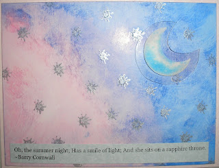
So, on to this week's challenge, which I hope you'll join: Use a summer or vacation theme!
As you might know from my previous summer-related post, summer is not my favorite season. However, I do love barbecue and, since childhood, have adored sleeping under the stars.
My card for the week then, is a mix of Color Box and Martha Stewart inks, sponged onto white gloss card stock over stars stamped with silver Adirondack Dabber.
I water washed the entire thing to soften the pink and blue, then added a moon sticker on a pop-up acryclic.
The sentiment is simply printed and trimmed to a desired fit.
Thanks for stopping by, and I hope to see you soon in the DS lounge.
Friday, July 2, 2010
Memory glass and alcohol ink
Apparently Memory Glass has been around awhile, but I've somehow missed the excitement until a recent trip to a local scrapbook shop.
Last week, while searching for a couple of needed products for the week's Compendium challenge, Sue at Scrapbook Paradise introduced to Memory Glass and the possibilities therein.
I'm only just learning about these products and techniques, but this stuff sure seems very cool to me.
This little suncatcher is made with two pieces of 2-inch square Memory Glass. I squeezed a few drops of ink onto one side of a glass square, along with two drops of pearl mixatives.
Next, I cut a strip of self-adhesive brass foil and carefully placed a strand of clear monofilament along the center of the strip.
Finally, I placed the second square on top of the inked square and edged both pieces with the strung foil.
Tada! Suncatcher!
Subscribe to:
Posts (Atom)